Whenever I’m in New York, I like strolling through my old neighbourhood of Park Slope, Brooklyn. I spent the summer of 2007 living there and it really does feel like a second (or third, now) home.
I had a 24 hour layover in the city a few weeks ago, and stopped by Gorilla Coffee on 5th Ave for a quick drink.
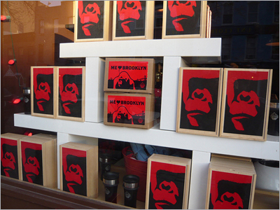
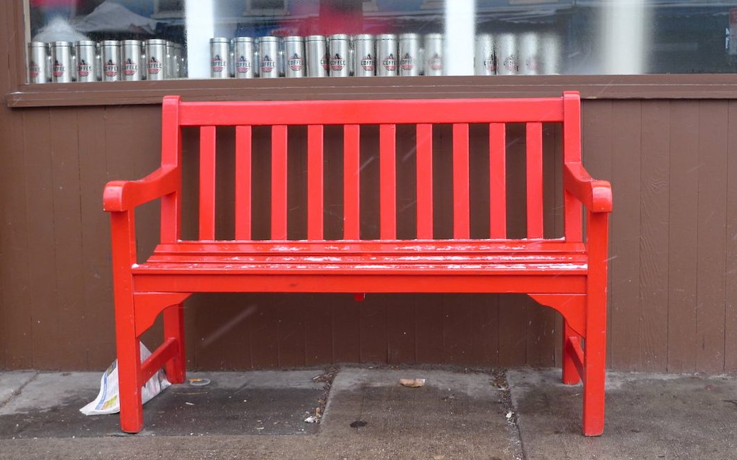
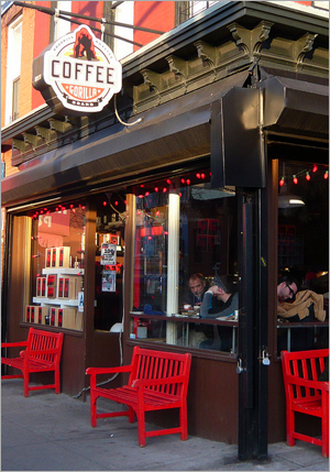
I like Gorilla Coffee. It’s a hangout spot for students and freelancers and has nice atmosphere. This is going to sound strange, but the other thing I love about it is their branding. Take a look:

Their branding is bold (just like their coffee). They use a LOT of red– it’s their colour, but they use it to stand out from otherwise neutral tones of brown, wood and beige. There are red lights adorning the big windows at the front. The table tops are red, but otherwise very simple, metal. The chairs are black, plastic and uniform, the sort of chairs you might find in a classroom. The gorilla image is featured prominently along with the red.
What does all this tell us (besides the fact that sexy branding works)?
The role of branding
Most people think of branding as the “face” of a company. That’s a really obvious interpretation. Effective branding goes a lot deeper. Branding isn’t just the “face” of your company. What it is, is the communication of your theme.
Let me repeat that:
Branding is the communication of Your theme.
Remember that overarching theme we discussed? The vital core philosophy behind your business which ties all your interests together? Yeah, that. Knowing that theme is not enough. In fact, it’s only the first step.
In addition to knowing your overarching theme, you also must also communicate that theme to your community in a clever way.
Step #1: Coming up with an overarching theme
Step #2: Communicating your overarching theme
Knowing your theme and communicating your theme are two separate steps. A lot of people confuse them or smoosh them together (and yes, “smoosh” is the technical term).
The “unclothed” theme
Imagine a website called “Gratitude” or “Happiness” or “Natural Living.” You’ve seen sites like this, I’m sure. No offense, but don’t these businesses sound a little lame and generic? That’s because, while they might have worthy themes (and who knows, maybe really great content too), these themes haven’t been communicated well. They haven’t been “clothed.”
The communication of a theme that doesn’t exist
Similarly, if a business has great branding, but they don’t know what they stand for (other than making money), they will struggle. Sure, they might get some customers with a slick image. But in the long run, interacting with them will feel empty and disingenuous. Something will feel off.
A business that doesn’t know what it stands for does not attract a rabid fanbase. Take Apple’s “think different.” versus pc’s– umm… what’s their theme? I have no clue what they stand for. No matter how much the PC people work on their branding, no matter what hip designers they hire, it won’t change the fact that they lack a core theme. (Or if they do have one, they haven’t don’t a good job of expressing it, since I have no idea what it is.)
Branding is the communication of your theme. If you don’t know your theme, your branding will ultimately fail. It’s really that simple.
What does “communicating your theme” consist of anyway?
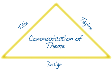
When it comes to Renaissance Businesses, I like to break the communication of your theme down into three important elements.
Behold, what I call…
The magical triad of clarity
Your title, tagline and design are the three elements that prospective customers will see instantly upon visiting your site. Content is of course “king” when it comes to long term growth, but without a good first impression, it’s unlikely that a new visitor will even stick around to read your content.
These three elements (title, tagline, design) when added up should communicate your theme to your people. Each element doesn’t need to communicate your theme individually. Rather, it’s the cumulative effect that matters. This means that a title that is less descriptive and more catchy in nature (say “Puttylike”, for example) needs to have a tagline and design that are more literal and express the overarching theme more overtly.
Similarly, a highly descriptive title can have a more playful tagline. All that matters is that, when combined, the title, tagline and design get that theme across.
How Gorilla Coffee communicates their theme
Gorilla Coffee’s theme is all about being local, independent and proud. I know this because everything in their branding communicates that idea. For goodness sakes, their tagline is:
“BROOKLYN BORN AND BRED”
(All caps.)
Gorilla coffee IS Brooklyn. They’re local, fresh and proud. They’re the powerful underdog (err..gorilla) who thrives, despite being the little guy. Design-wise, the gorilla graphic and the colour red alongside neutral tones, absolutely communicate this theme.
Now I’m not saying that you need to be this bold with your branding. Only do it if “boldness” is part of your theme. My point is that you can’t just figure out your overarching theme and stop there. You need to take that next step and find a clever way to “clothe” your theme.
In the upcoming Renaissance Business case studies, we’ll look at the process two multipotentialites took to turn their overarching themes into a title, tagline and design.
Your Turn
Do your title, tagline and design work together to communicate your theme?
**
If you’d like to learn more about turning all of your interests into one business, check out Renaissance Business.


I think part of the lack of a coherent PC theme comes from the fact that there are multiple computer producers (Dell, HP, etc.) that all have their own brands & then Microsoft that’s producing the Windows operating system & a bunch of software with their own brand. But yeah, none of them have come up with a theme or core philosophy & communicated it like Apple has.
Thinking about it in terms of clothing is a great idea. We communicate things with our clothing too!
I’m excited to read the new case studies. 🙂
Hey C.C.,
Good point. But still, none of those PC brands inspire me with any kind of core message. And you’re right, we do communicate with our clothing. Love the literal analogy!
HP has a tagline. ‘The PC is personal again’ or some crap. I think Microsoft has one, too, ‘We make really bloated and convoluted software.’ .. maybe that’s a bit off (of course, I hate on all computers – 6+ years working in IT does that to a person)
Since I’ve been building up TimmyBurns.com I have been really looking at what makes a website feel good, and what other sites are missing. I’ve got a notebook in Evernote where I insert screen shots of website elements that I really like or that really pop out. I look to these for inspiration or guidance when I need to think about the look/feel of the my site.
Of course, injecting a personality (hopefully that personality is your own) into the site helps create the branding and also allows the branding to be very consistent. If you keep all the elements of your website personal then (as long as you’re not suffering from multiple personality disorder) everything should have the same feel.
Can’t wait to have a look at some case studies! Weee!
Hey Tim,
Yup! I didn’t have room to get into that in this post, but I actually believe that the role of design is two-fold. It should 1) communicate/support your theme, and b) communicate your personality.
You’re right, injecting personality is vital and the design is a great place to do it. But as I mentioned in an earlier post, you’ve got to be careful to keep the primary focus on THEM, not you.
What you do is put forward your personality in your design and writing style, but you do it in a way where it’s about furthering or explaining a bigger point– one that your people can relate to.
Congrats on the new site! Looking forward to seeing what you do with it.
Interesting article – I especially like the Brooklyn example – they DO have cool branding.
The red and black Gorilla is sooo cool.
But I have to disagree about Apple – that company has nothing to do with “think different” and “changing the status quo” – hell, there ARE the status quo 😉
Even Simon Sinek, the guy who’s always raving about the company, admitted in a recent interview that Apple lost its touch and turned into another corporate giant.
LOL.. The Apple vs PC debate really wasn’t meant to be the crux of my article.
But anyway, I think what you’re pointing at Mars, is the nature of brands that get too big– the “sell out” phenomenon. If you have a rebel brand identity, is it possible to maintain that identity once you grow and become popular with the mainstream? Do all cool brands become lame once they grow? It definitely becomes more of a challenge to maintain your philosophy at that point. Interesting discussion.
I think that, in addition to politics and religion, ‘Apple vs Windows PC’ should be added to the ‘Things That Instantly Start an Argument’ list hahahah
Hah- no kidding.
This is something that I’m working on right now. Thanks so much for putting everything into perspective for me. I have 2 out of 3 that I’m happy with, but working on the third is going to take some time. It’s a work in progress that I’m excited about.
Cool stuff, Kelly. I’m checking out your site now and guessing that design isn’t the missing link! 🙂
“If you have a rebel brand identity, is it possible to maintain that identity once you grow and become popular with the mainstream?”
Love this! Let’s see…I say no.
I thought of Harley Davidson (motorcycles) & most tattoo magazines or parlors as examples of rebel brands that maintain their brand identity as they become popular, but it occurred to me that they really aren’t mainstream. They’re still a subculture. So I say no. I think rebel brands’ identities will shift when they become mainstream. With the example of Apple; They are still different, since they have their own unique style, but they are no longer a rebel brand. They started out cool & rebellious, & they still have a “cool” image, but they’re a big corporation now so there’s no way for them to hold onto that rebellious aspect that was a part of their identity in the beginning.
Does that make sense? I haven’t been sleeping well lately so my brain is a little fuzzy.
& yeah “Apple vs Windows” is totally on the argument-starters list.
I actually do believe that even though Apple is mainstream, their “think different” philosophy is still working for them. It might not be true anymore, but who cares? People are still buying their products. The image they’re projecting is still working.
You see this in the hipster world a lot. A band is super trendy one day, but then they get “too big” and suddenly, they’re not cool anymore. Still, some bands do remain “cool” even once they’re popular (take Feist for example).
I think the secret is in not embracing it. Just being like “yeah whatever… I’m popular. So what.” That kind of attitude seems to help prevent the perceived loss of authenticity.
hmm, maybe this is the problem with my website (that and I abandoned it for a month because I decided that I lost interest in drawing a comic every week when the comic started out as a fun blowing off steam & in addition to other stuff).
My theme is adventure, but I’m not sure that I’m communicating that in a good way…. paying attention to the cool triangle and thinking what to do.
Hi Mel,
Well there could be a few different things going on. As scanners, we tend to jump into projects fast and then lose interest fast. That’s one of the reason an overarching theme (as opposed to a specific theme) is so important.
Doesn’t sound like that’s really your problem though. When I go to your site, I don’t get “adventure” so much. I get nerdiness and creativity from your title and design, but then your tagline throws me because it’s about self-employment.
I wonder if the triangle’s the problem or if it’s that you need to refine your overarching theme so that it encompasses more of your interests. Check out Tyler Terveroon’s site, Advanced Riskology for example. He writes about adventure, mountain climbing, business, dating, productivity, etc. and it works because his overarching theme is “risk taking”. That’s what links it all together.
Does gorilla coffee do guerilla marketing? 🙂 I LOVE the color red and it does well for restaurants. I think if my color theory is correct, the color stimulates your appetite! As a designer, it’s definitely NOT weird that one of the best things you like about them is branding! I’m a nerd for good brands.
I’ve never heard that about the colour red. Super interesting. I wonder what mint green stimulates. 🙂
Mint green is used a lot to convey ideas that are fresh, new. Industries that use green usually center around the environment or money. Green is also the color of your heart chakra. Interesting choice for you!
Red is used all over the food industry (not just restaurants). Take walk down the grocery aisle and you’ll see all the warm colors: red, orange and yellow. It stimulates appetite.
BTW – love this post! I’m doing a series on branding right now over at my blog and can testify that you’re right on here.
Branding confuses me. I know it’s important, but it’s been a challenge for me. I’m just a person. I just don’t see myself as “apple” or “coca cola” or something..
This is a great post, though.. I’ll be thinking about my theme/ brand this week.
Hi: I really liked your brief video about you and plans for the website.
Looking to follow your adventure while following my own.
I’m going to try to get to Park Slope in my travels now that you’ve introduced me to it. Seems like a vibrant place.
Really glad I stumbled across this post right now! I’m in the throes of rebranding, merging my two sites, and figuring out what REALLY is my brand and how can I express it? Can’t tell you how helpful this is. Bookmarked for my brainstorming.
I spent summer 2008 in NYC, and a month in Park Slope! LOVED Gorilla coffee and whiled away many happy hours in there.
This is a wonderful post Emilie, very clear and has made me think more about my own ‘brand’.
To be honest, I never really thought too much about a brand or a theme much further than a name for my site and a tagline which admittedly is probably quite vague but I really like.
I do get your point though and have only one thing to say on the apple issue: “Once you go mac you never go back”
I don’t really like the fact that Apple have somehow taken over my life by stealth but you gotta love their products…
take care & best wishes,
Alan
I’ve had a tagline and a sub-tagline for ages, because even though “Estuary Magicks” is a name I’m quite pleased with, it confuses some people who don’t know what an estuary is. To alleviate that — and paint a picture of my creative venture, I write “where the fresh water meets the sea.” But under that (and at the end of all my emails, etc etc) I always type “love the world you live in” — and reading this, I see how THAT is my real theme.
I’m working (slowly, but surely) on graphic design, but I’m wondering if I’m setting myself up for confusion. Is there a divergence between the concept of the estuary as a breeding ground for creativity, and this love-and-respect philosophy?
Maybe I’m just thinking out loud now.
Hi Emilie,
For three years I’ve been stuck with the burden of my title and tagline. I’m dreaming of the day that my new, stylish name and zippy quote arrives. I expect it to show up in a light bulb moment, maybe while I’m doing something totally unrelated to business.
I’m realizing through your post that I do have a theme, which is the encouragement of play though the subtle use of fabrics with furry textures and natural patterns and colors. The big picture is that children who love to play will be encouraged to keep imagining, to keep pretending, to keep acting out roles in the theater of their own imagination. (A playground where all little mulitpotentialites are valued.) Obviously, children don’t grow up to be animals, but for a time they pretend. When you’re three, or six, or maybe even eight, it’s fun to lap up water from a dish, purr, and crawl on hands and knees (hence, knees and paws.) There are seasons in childhood devoted to simulating the reality they observe in domestic settings and also the natural world. I want to make the play clothes for those fleeting seasons of play.
Specifically, I have a line of handmade products that are intended for kids who love to pretend to play cats and dogs (and the occasional wild creature thrown in for variety.) How to make this compelling and cohesive is my challenge. My blog gradually slipped away from the business part and ended up being a mixture of personal thoughts and friendship building. The triangle you shared helps me to keep thinking about the goal for a cohesive message.
And also I end up putting various unrelated products into my shop…like paper houses and psanky eggs. I’ve tried to stick with one thing, but end up with a bunch of variety that doesn’t fit.
I would love to create that kind of environment on my website! I love those little hole in the wall coffee shops (I read/wrote many a lit assignment in a few of my favorite shops in college).
I really have no idea where to start doing that on my own website, I don’t know if it has that ambience. I’ll start looking at it with fresh eyes! (If only there was a way to send the aroma of coffee through the screen!)
No, they do not. But I will re-think my efforts into coming up with something much more brandable. There is a small Mexican restaurant down the road. The food is good and the service is average, but I now know what keeps me going back. It’s the ambience, atmosphere and the customers I meet there.
Thanks for this post as it has inspired me to continue branding my own name.
Paul
I think what you are saying in this teaching is dead on. I’m in the process of revamping my site. Would love to hear what your brilliance says about it! Keep up the great work. I love your company. Yoga Jane
Apple starts with the WHY first. Their fans believe in the vision. That’s why they pay the bloated process for them. I’m not an apple fan myself, but their branding is right on. What person who has an apple covers up that Apple symbol? None. In fact the cases for the iphone all have that gaping hole to show off that symbol. It’s status. It’s brand. BTW I stole all this from a TEDx talk. Simon Sinek. It’s actually one of the top ten TED talks. And now that I think of it, your topic on multipotentialites would be perfect for a TED talk. It goes along with your interest in public speaking too. Love your work.